
 As I was surfing about this evening, I came across this poster, which I later ordered.
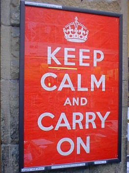
“In the Spring of 1939, with war against Germany all but inevitable, the British Government’s Ministry of Information commissioned a series of propaganda posters to be distributed throughout the country at the onset of hostilities. It was feared that in the early months of the war Britain would be subjected to gas attacks, heavy bombing raids and even invasion. The posters were intended to offer the public reassurance in the dark days which lay ahead. The intent of the poster was to convey a message from the King to his people, to assure them that ‘all necessary measures to defend the nation were being taken’, and to stress an ‘attitude of mind’ rather than a specific aim.” — Barter Books
This poster sums up the way I try to live my life. Keep a level head, don’t freak out in crisis, stay calm and keep moving forward. When I thought of God, my King, looking down and saying to me, “I am in control here. All necessary mesaures to defend You are being taken. I am the commander over this battle and all you need to do is keep calm and carry on. Walk in what I called you to walk in. Stay the course.” God is not up in heaven freaking out every time something moves on the planet earth that might catch us [humans] off-guard. He’s fully cognizant of the reality of every minute detail occuring at all times on this planet. Something about that puts me at peace, knowing that even though there are dark days ahead for us as a nation, we can rest in the fact that we have a King that has made sure that the defenses are in place and at the final battle, He will emerge victorious. Until then, we “Keep Calm and Carry On.” This is a message of hope, and of certainty.
good post
I love that it’s marked with the crown. I do have to inquire however at the color of this poster. Is it red? Is it orange? I pulled out Dave’s pantone guide to communicating and had a good laugh. If the poster is red it invokes this emotional message: “…alters your body chemistry, causing you to breathe more rapidly, increases your blood pressure, pulse rate, heartbeat, your flow of adrenaline and Galvanic Skin Response (a fancy term for perspiration…).” If it’s orange: “It is perceived as a color that shouldn’t be taken too seriously…” Since the first color matching system wasn’t in place until 1963 (www.designface.co.uk/content/pantonehistory), perhaps the Queen’s Royal Graphic Designers were simply trying to get everyone’s attention. P.S. That was a lot of research for a good laugh, but it’s early and I’ll take it.
I needed this today.
Thank you.
Liz – I have also seen a version of this poster in a slate blue with a tint of green. Not teal or aquamarine. I wonder what that would say.