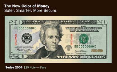
If you haven’t seen the new $20s… go find one. They are pretty interesting. My thoughts as a designer:
Front
1. I don’t like the way Federal Reserve Note is spread out across the top. It looks awkward and unbalanced.
2. The front of the note looks very cluttered and jumbled � as if they were given a bunch of elements that they had to have on the note and they just stuck them in random places here and there.
3. I do like the absence of the oval around the president. Having it cut out and placed naturally on the note is a much better solution than the previous $20 note.
4. The addition of color is nice, although, as Liz Carey pointed out, it does look like the note was dipped in ink on the ends.
Back
It is pretty straighforward and simple. In fact I like most of it. Except for the giant Helvetica 20 in the lower right corner. And then for some strange reason they put all of these little yellow 20’s all over the back. Like a swarm of bees around the White House. Perhaps they are supposed to represent the lobbyists or protesters, I am not sure. In any event, they certainly ruined the simplicity of the back of the note.

It will give me something to look at while standing for hours in the holiday lines. I could hold it up to the light and try to find the face on the back. Other shoppers might look at me strangely, but that’s a small price to pay for alittle amusement while standing in long lines. *wink!
Security was the aim… I like them… I wish they would have used more color.they are cluttery design wise but there is more interest and they will be harder to duplicate. word.
i think they were going for the “impossible to duplicate” look.
i hate them. i can no longer say anything joining “money” and “green.” i hate them.